While I was reading Adam Lasnik's "little algo secret", I noticed the Google Groups Beta design is now officially out of beta. I personally really like the new design.
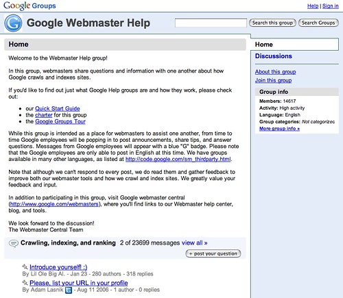
The new design has changed from the orange/yellow color to a light blue color. It is more Web 2.0 stylish and has some new features.
Here is a screen capture of the top part of the Google Groups - Google Webmaster Help page:
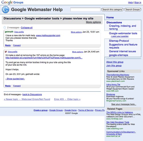
Now, here is an image of a specific thread, I find it much cleaner then before:
Of course, Google Blogoscoped has the before and after screen captures and links to some issues with the new design.
For a guided tour of the new Google Groups, click here.
New Features Include: - Pages. Create and contribute to shared web pages with simple drag, drops, cuts, pastes, and clicks (i.e., no coding). - Customized look and feel. Select pictures, colors, and styles to express your group's style. - Member profiles. See who else is in the group and read their profiles. Personalize your own profile with a photo and other details. - File sharing. Post documents that anyone in the group can access. - Easy reading of group discussions. Read easily in a Gmail-style interface.
Forum discussion at Search Engine Roundtable Forums.
Oh, don't forget Adam's little algo secret from above...
And I'll let you in on a little algo secret: There is no single magic number. People who say "The guaranteed optimal keyword density is [x]%" would ideally meet the same fate from an angry English teacher. Or Googler or Webmaster.
Which we discussed already here.


