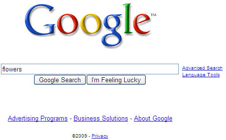
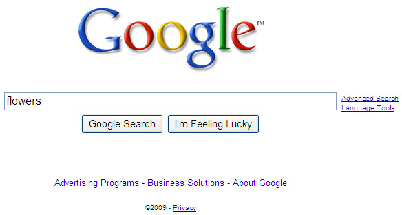
Google's Mayer announced last night that the search box's size was increased. The box is bigger, the text when you type is bigger and the search suggestions are bigger. Honestly, I am surprised we did not spot Google testing this on the public, but we didn't.
There is a lot of discussion around this. Tedster at WebmasterWorld is with me on this and feels Google never really tested it (or else he or I would have seen it or someone reporting that Google is testing this). Some find the new look to be immature and worse off than the previous look.
Robert Charlton has some measurements:
OLD SEARCH BOX - left edge to end of flowers = 43 px - width of search box = 366 px - width of flowers compared to width of box = 11.7%
NEW SEARCH BOX - left edge to end of flowers = 54 px - width of search box = 483 px - width of flowers compared to width of box = 11.2%
Another person asked if this might lead to "more long-tail searches."
Anyway, as I said, most people are not too happy about the change - at least those voicing their opinion. Personally, I barely notice it.
Forum discussion at Google Web Search Help, DigitalPoint Forums and WebmasterWorld.


