Yesterday, Danny covered a new user interface Google is testing on about 2% of their users right now. The interface is known internally (actually, it is not named this internally, but the name is catchy, so maybe we should use it?) as the Jazz UI and is much more colorful, has streamlined search options and kind of looks like the the old Ask 3D interface, just a bit. This new UI might be launched after the holiday season to everyone, so be ready.
Danny wrote (but read the all the details, if you will):
Sometime later today, a small number of Google users will see a new look to Google’s Search Options feature. If all goes well, the cleaner display may be launched across Google after the New Year. And it’s all because Google’s vice president of search product and user experience Marissa Mayer doesn’t like jazz.
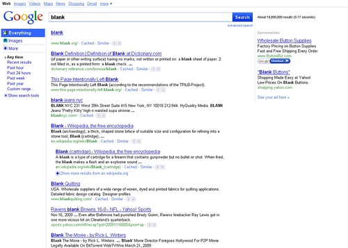
There are some people who actually see the new interface. There are two thread at Google Web Search Help, one with screen captures, which prove to me they see it. Here are those screen captures:
This person simply asked, "can anyone help me get Google's regular look back?" The other comment reads:
I did a search a couple minutes ago and it seems like they changed their user interface to look more like a Bing or Yahoo search. For me this is a major fail because the beauty of Google was not only did it feel comfortable, it gave me a wide variety of options like the site links at the side of the page and the sposored links at the top of my search. I think Google should remain the way it was, maybe some minor tweaks but making it look sterile and utterly boring like Bing won't win fans. No other search engine has ever managed to knock Google off the top, so why are they downgrading to a less popular model?
Can't make everyone happy, now can you?
Forum discussion at Sphinn and Google Web Search Help.


