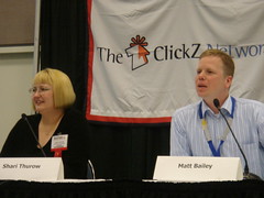
Moderated by Rebecca Lieb of ClickZ with presentations by Matt Bailey of SiteLogic and Shari Thurow of Grantastic Designs.
First up is Shari who answered questions about usability and search.
What is usability? Shows term highlighting in Google search results. Titles, snippets and web address.
Web site usability serves two purposes: Relevancy and encouraging clicks to your site.
Usability addresses all search behaviors. - Querying (refining, expanding) - Browsing, surfing - Pogo-sticking (Jared Spool) - Foraging - Scanning - Reading
What is web site usability? Shari believes usability is a quality attribute that assesses how easy user interfaces are to use (Jakob Nielsen). Usability is task oriented. Usability meets a balance between satisfying users and business goals.
Information architecture precedes building the interface of a web site. Shares interface usability best practices. A balance between good architecture and the interface means the site has meaning whether there is search engine friendly content or not.
Interface: Areas of a website that are of benefit to users and search engines - Navigation - Linking
People need to understand where there are on a web site. A sense of place is what tells people where they are in a web site and also provides information to search engines.
Cross linking is important: horizontal and vertical. Vertical links are often breadcrumb links. Breadcrumb links provide "sense of place" cues, they are keyword focused and also provide a keyword optimization opportunity. They also communicate visited and unvisited pages.
Also need horizontal cross links. Types: embedded text links, related links, alternative links, alphabetic links.
Site maps should be part of the information architecture. Add a link both above and below the fold.
URL structure is part of the interface. Hyphens are better than an underscore. Also avoid problematic characters: &, ?, =, $, +, %. Short urls with keywords are usually better.
URL structure does not affect ranking, but it does affect accessibility.
Shari winds things up with a case study on Medicine.net and a reminder that usability is for both users and search engines.
Next and last up is Matt Bailey from SiteLogic with a special pen that he used to mark up example web pages.
SEO - get people to the site. Usability - Get those visitors to do what you want them to do.
The main problem with usability is that for users, if they can't find it, it's not there - it doesn't exist. Same goes for SEO. If you're not ranked, you don't exist.
Matt explains what is important for both SEO and usability on the home page. It should be clear immediately what the site is about. It should also lead them to the information they're looking for.
Uses several sites as examples bad usability. Don't call your products, "products" and services, "services". Label content based on descriptive phrases rather than generic references. Make sure links to content are obvious and easy to read,
Taxonomy: hierarchal structure, classification, grouping. Offer alternative methods of getting to content because users search differently.
Category Pages - Use established set of categories with supporting categories. Use Keywords in the links to categories. Obvious links to products with images. Be careful of cramming categories together, as that will dilute the relevance for each.
Great example of usability: thinkgeek.com, wine.com
Product Pages. Matt's advice is to call products what they are. Give product information so users understand and to include keywords. Selling products to the logical and emotional sides of a consumer will involve the use of descriptive content and keywords. Include benefits to answer the questions consumers have and to provide keyword rich content.
Landing pages should provide exactly what the consumer is looking for.
Matt provided a variety of examples showing good and bad usability with a particularly humorous example involving something called "butt paste".
Usable Analytics - Analytics can be the key to finding usability problems. Also segment your keywords and content according to the users' needs.
Great job to Shari and Matt on this presentation. It was one of the best I've seen at this SES. Very informative, lots of examples, some humor and a great session overall.


