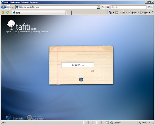
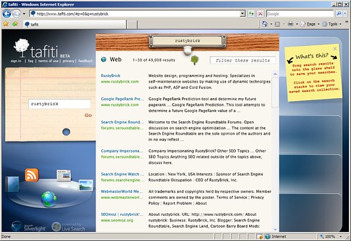
Last week, Microsoft launched Tafiti, a search engine that is powered by its new Silverlight technology. I played around with the features and have showed some screenshots of the new search engine in action.
Once Silverlight is installed, you see a nice little notepad where you can scribble type in your search.
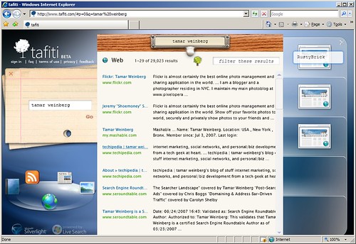
You're then presented with some results and can drag interesting results to a glass pane on the right hand side of your browser.
Then, you can label these saved searches:
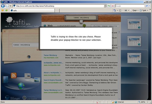
The downside is that you have to turn off your popup blocker in order to see any selection. I found that a bit of a hindrance.
WebmasterWorld members feel that the saved search functionality is useful, but there's not much potential for Silverlight. After all, it is a direct competitor to Adobe's Flash which has been around for over a decade.
Even so, it has a "web 2.0" feel, which some members welcome:
Regardless of the result its always good to see companies experiment, especially with a user interface. That said, I think the site, visually, leaves alot to be desired. I have Visual Thesaurus, which I love to use, that makes Tafiti look pretty primitive, but the storing/sharing of multiple searches could be useful.
Others just don't see much use for it.
Google have it right...give people the results with a minumum of fuss and time. waiting for those animations every time I do a search would drive me up the wall.
Forum discussion continues at WebmasterWorld.


