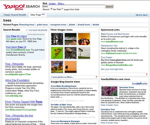
Barry at Search Engine Land points out that Yahoo India has glue pages, which some people are comparing to Universal Search, because of classic search results on the left hand column, visual information in the center column and bottom right hand corner (in addition to articles), and sponsored results.
Here's a screenshot for a search for trees. Click to enlarge.
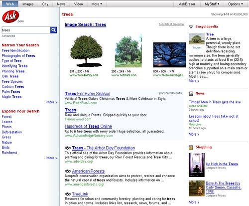
The idea is pretty cool and sticky (pun intended) and the results page is definitely more aesthetically pleasing than the standard 10 blue links. It kind of reminds me of the current Ask.com format:
Forum discussion continues at Sphinn.


