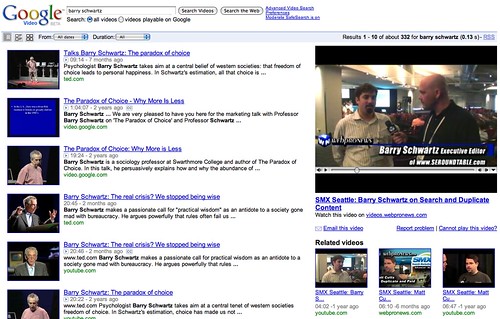
It appears Google has launched a redesign of the search results pages on Google Video. For example, a search on barry schwartz returns search results on the left side and the video on the right. If you click on a search result, it shows the video directly on that page and gives you the option to click through and watch it on the site it came from.
Here is a picture:
A Google Web Search Help thread (note, the Google Video help forum is no longer, they moved it to the web search section) has a couple users who are unhappy with the new layout. The new layout is due to the fact that Google doesn't allow video uploads on Google anymore. It is now just a search engine for videos, while YouTube is their upload and user generated content (video) section.
One user said:
I am seeing a redesign of TV view when I search for a video in Google Video. The video description is takes up a lot of space, the video is smaller (and not expandable) and there is no way to rate videos (or even see video ratings!).
Alex Chitu said, "the new interface has a lot of flaws: the video player moves as you scroll down, the list of related videos is not always visible, Google Video no longer displays ratings and there's a lot of unused space."
Forum discussion at Google Web Search Help.


