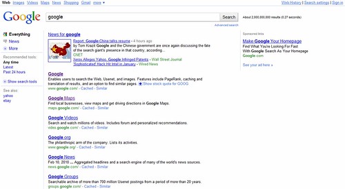
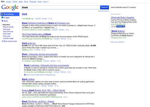
Google has been experimenting with the Google Jazz Interface (I know Google doesn't call it Jazz internally) since November of last year. It appears that Google has slightly updated that look from what we originally saw.
A Google Blogoscoped Forums thread has a picture from one user of the new Jazz look.
Here is the new look:
Here is the old Jazz look:
They are very similar but there are slight differences.
In the thread, they also share how you can get this user interface on your Google. Here is how:
Go to Google.com (Press Go to Google.com if you are brought to a localized version of Google, this won't work for localized versions evem if you change the code to .google.ie or whatever instead of .google.com)Put javascript:alert(document.cookie="PREF=ID=496cfd992ab9f273: U=a77c3a4da3815c1d:LD=en:CR=2:TM=1260896352: LM=1267013388:DV=8atQZBunt08B:GM=1:IG=1 :S=1ebLUyXkRkBnJMYi;path=/;domain=.google.com")
into your addressbar (NOT the Google Search Box) and press return.
Searches on Google.com should now use the new layout.
Forum discussion at Google Blogoscoped Forums.
Hat tip to Michel.


