Microsoft announced their new look yesterday, with a big push in entertainment and also a revamped iPhone App.
Matt McGee has a pretty detailed look at the Bing design changes, Elisabeth Osmeloski took a look at the expanded entertainment features and dug into the Bing iPhone app changes at Search Engine Land.
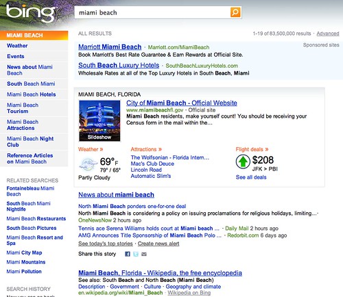
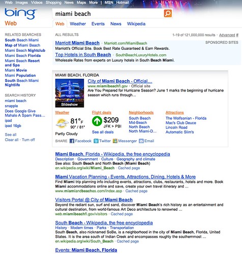
I wanted to show you a search result from before and after. The before picture is from the end of March, so fairly recent:
BEFORE:
AFTER:
Things seem more tightened up and cleaner. Overall, it seems people are happy with the new UI, new features and new refinements.
Forum discussion at Bing Community, DigitalPoint Forums & WebmasterWorld.


