I am shocked, honestly shocked. Google recently redesigned Google News, and based on our poll, 85% hated the new design. I have been tracking complaints in the forums for weeks now and the complaints have no slowed. I really thought Google would not care, like with the complaints with the Google fade in and web search redesign but they did - they caved and they made changes to appease their users.
I assume enough users left Google for Google to announce Google News changes reflect your feedback:
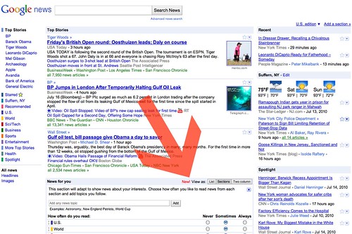
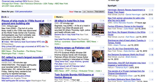
At Google, we’re all about launching and iterating, so we've been making improvements to the design in response to your feedback. For example, we're now showing the entire cluster of articles for each story, rather than expanding the cluster when you hover your mouse over it. We've given you the ability to hide the weather forecast from your local news section. We made the option to switch between List view and Section view more obvious. And today we’re adding a third option in "News for you": Two-column view, which shows the three top stories from each section and looks like this:
So now, if you go to Google News, you will see a box in the middle letting you select the column type:
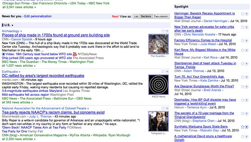
Here is the single column, which many disliked:
Here is the new double column view:
Fred from the Google News team posted a Google News Help thread about this update. He said, "We’ve been reading these forums and following all of your feedback closely. In large part because of the feedback we’ve received here and elsewhere, Google News has just launched a “Two-column” view in the News for you stream."
So far, it seems not everyone is happy yet. I really suspect this is the last major change based on complaints from Google.
New Poll, do you now like the new Google design?
Forum discussion at Google News Help.


