A week before Google announced the launch of the new Image Search design, we spotted it and wrote about it. We even posted detailed pictures of the new image design.
Now, yesterday, Google announced it and everyone should see the new design. Before I get into the complaints, watch this quick video on what changed:
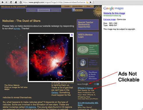
The main issue from a webmaster perspective, as noted in WebmasterWorld, is that when you click on an image, it doesn't take you to the site. Instead, it keeps you on Google, overlays the image in large format on top of your grayed out web site.
So any ads on your site won't be clickable after the first click from Google. Users are instructed to either go back, click on the web site with the image or click on the actual image source file. I should note that clicking anywhere on the background web site will take you to that web site. Here is a picture:
Outside of that, there are complaints from searchers. The complaints are not as loud as with the Google News redesign or Web Search redesign or the fade in approach, but there are some. There was actually an interesting bug reported at Google Web Search Help. Here is how you duplicate it, go to image search, search for something, scroll the page, click on Google's logo, search for something else and click on "images".
Out side of that, many people are calling Google out on copying Bing one more time.
Forum discussion at WebmasterWorld, DigitalPoint Forums and Google Web Search Help.


