I love it, Google keeps tweaking their re-design to make it more similar to the look prior to the redesign. Why? Their users keep complaining and asking for the old design and Google made one tweak a month or so ago and now made another tweak.
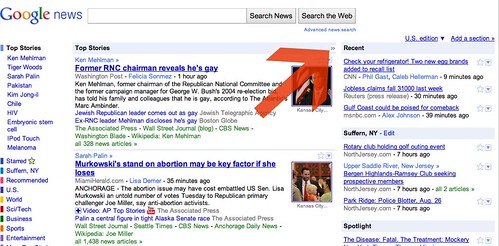
Now, if you visit Google News you will see a right arrow at the top middle section. Clicking that arrow will push those articles to fill the screen and drop out the right hand "recent," "local," and "spotlight" sections. This hopefully will resolve most of the complaints?
Here is a picture of the arrow:
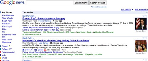
When you click it, it does this:
Googler, Fred posted a thread at Google News Help saying:
Just a quick update to say you can now collapse or expand the side column (featuring Recent, Spotlight, Fast Flip, etc) on the Google News homepage.To do this, locate the small double arrows at the top right of the screen; they appear in the Top Stories bar on the far right, next to the word "Recent." Click the arrows once, and the side column collapses. Click the arrows again, and the side column reappears.
If you have any questions, please let us know. Thanks again for using Google News, and for being patient while we continue to work on improved features.
Some are happy with the change and of course, some are not.
Forum discussion at Google News Help.


