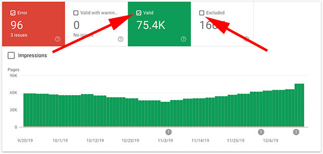
This is a small but useful change Google made in Google Search Console. So the report overview pages for the performance reports, the coverage report, etc, now have small checkboxes in the boxes so you know when a specific category is selected. I always thought highlighting the box in a color was good enough but I guess some were confused?

This is a small change but this does seem to be a new change. Aja Frost from HubSpot notified me of this:
New checkboxes in GSC that makes it easier to see the relationship between the metrics you've selected/the chart below. (@rustybrick this is new, right?) pic.twitter.com/ZHd8uZJKpa
— Aja Frost (@ajavuu) December 16, 2019
Did this ever confuse you?
Forum discussion at Twitter.

