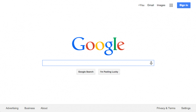
 Many folks are reporting in the Google Web Search Help forums that Google is bringing back the old design that has either the black top bar or the gray top bar.
There are people who can see it in all sorts of browsers including Opera, Firefox, Safari, Chrome and Internet Explorer. I am personally unable to replicate it but here are screen shots:
vs what should be
This may be a Google test, or Google may be switching to this new design or it might just be a weird bug. We are unsure at the moment, as Google has not commented in the thread.
It seems like with this design, the search results actually break a bit.
As soon as we hear on this, we will update this post.
Forum discussion at Google Web Search Help.
Google updated the post saying this is not a bug but by design. Google wrote:
Thanks for the reports. I want to assure you this isn't a bug, it's working as intended.We’re continually making improvements to Search, so we can only provide limited support for some outdated browsers. We encourage everyone to make the free upgrade to modern browsers -- they’re more secure and provide a better web experience overall.


