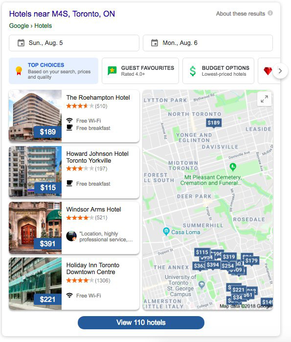
Last week we reported that Google was testing a new hotel search results design - well, Google is back at it with yet another design for the hotel search results. Reshav Singh shared a screen shot on Twitter of this new look, instead of just listing these cards straight down, Google is showing two side by side, with a total of four cards and a link to show more:

Here is what it looked like in last weeks test:

Again, Google is super active in testing user interfaces around local and hotel results these days.
Forum discussion at Twitter.

