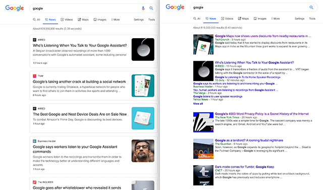
I am personally seeing the new card layout when I do searches in Google News on some browsers. On Chrome Mac, I get the card layout but on Safari Mac I get the old bundled list layout.
Here is a screen shot showing the layouts side by side, you can click to enlarge:
This design looks more like the mobile interface for Google News search.
I personally prefer the old format because it shows more sources about the same topic right on the same screen.
Forum discussion at Twitter.
Update: Not a test but it is rolling out, here is a tweet from Google:
Over the next couple weeks we’re rolling out a redesigned News tab in Search on desktop. The refreshed design makes publisher names more prominent and organizes articles more clearly to help you find the news you need. Check it out 👇 pic.twitter.com/xa2aZfO4Qd
— Google News Initiative (@GoogleNewsInit) July 11, 2019


