![]() Google News representative, Inbal, posted a thread at the Google News Help forum stating that Google is testing yet another Google News home page design.
Google News representative, Inbal, posted a thread at the Google News Help forum stating that Google is testing yet another Google News home page design.
She called this new design the "clusters" interface and is only being shown to a limited number of people.
I am not sure what is meant by "clusters" but I tweeted to my followers asking them to check Google News and let me know if they see a cluster-like design and I received two responses, all with the same screen shot.
Let me first show you what I see. You can click on any of the images for a larger version.
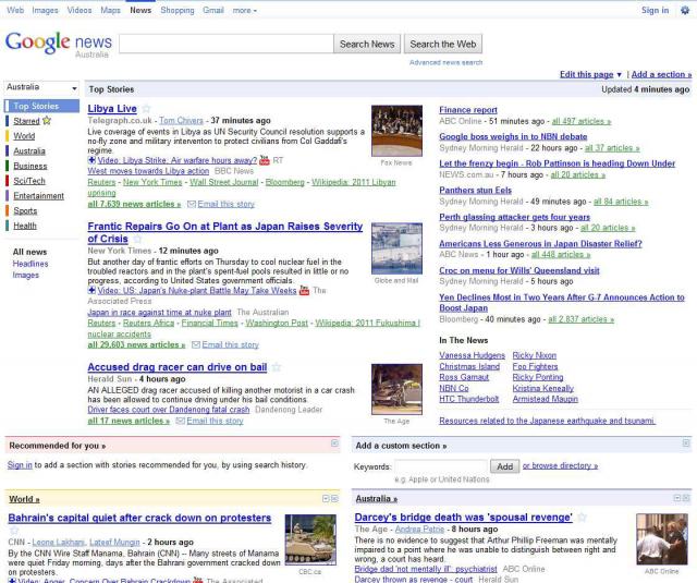
Current Google News Home Page:
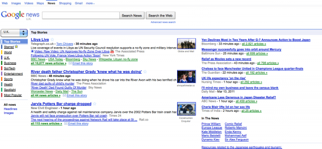
Screen Shots from Magstags.com and Net Magellan of the possible, but not confirmed, Google News Clusters interface:
and...
Is this the "Clusters" Google News home page? You can see the home page of news is tighter, with more stories at the top.
Forum discussion at Google News Help.
Update: I have an update with possible real screen shots over here.


