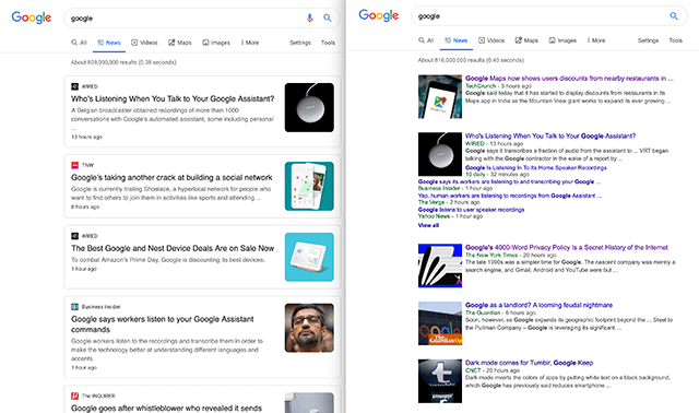
We saw Google testing it the other day (like two nights ago) and yesterday afternoon Google confirmed it for me on Search Engine Land and also on Twitter. Google launched a new card-layout design for Google News search results on desktop. It also includes these people also search for boxes as well.
Here is the new look, you can click on it to enlarge. Notice the section for people also search for as well.
Like I said at Search Engine Land - Google News publishers may see either a huge drop in Google News traffic or a massive increase. If you are the single card that shows up, you can win big. But Google is not going to show as much of a diverse set of sources because they dropped the cluster feature.
Here is the old and new:
Over the next couple weeks we’re rolling out a redesigned News tab in Search on desktop. The refreshed design makes publisher names more prominent and organizes articles more clearly to help you find the news you need. Check it out 👇 pic.twitter.com/xa2aZfO4Qd
— Google News Initiative (@GoogleNewsInit) July 11, 2019
Forum discussion at Twitter.


