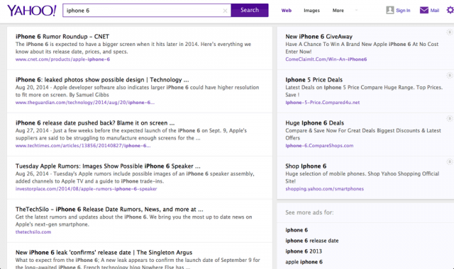
Yahoo Search Results Design Test More Card/Box Like

Aug 27, 2014 - 8:32 am 0 by

Yahoo LogoYahoo is testing a new design for their search results page. The new design is drastically different, making the layout much more boxed in, more like a card look, that would work well across both desktop and mobile devices.

This was picked up by @rgomezric who shared this screen shot on Twitter:

click for full size

The current design looks like this:

click for full size

Here is a video of the new Yahoo design in action:

Bing is also testing a new design and Google is always testing also.

Forum discussion at Twitter.


Popular Categories

The Pulse of the search community

Search Video Recaps

 
Video Details More Videos Subscribe to Videos

Most Recent Articles

Search Forum Recap

Daily Search Forum Recap: January 2, 2026

Jan 2, 2026 - 10:00 am
Search Video Recaps

Search News Buzz Video Recap: Google December Core Update Done, News Publishers Hit Hard, Frankenstein AI Recipe Horror & Happy New Year

Jan 2, 2026 - 8:01 am
Google Search Engine Optimization

Some News Publishers Saw Big Declines With The Google Core Update

Jan 2, 2026 - 7:51 am
Search News

(John) Mueller Report Of SEO Memes (2025 Edition)

Jan 2, 2026 - 7:41 am
Google

Google Search Tests Blue Send Button In Query Box

Jan 2, 2026 - 7:31 am
Google Search Engine Optimization

Google: Why 404s Don't Matter For SEO

Jan 2, 2026 - 7:21 am
 
Previous Story: Facebook Explains How Their Spam Algorithm Will Fight Click Bait